Benjamin Kahn
Design & Project Coordinator
Campaigns · Environments · Creative Coordination

From concept
to delivery.

I develop ideas, organize the work, and move creative projects from concept to delivery — across campaigns, brand systems, and built environments.

Project scoping · Stakeholder communication · Deliverable planning · Timeline management · Vendor coordination · Feedback and revisions · Creative production · Design development · Technical documentation

Selected Work
How I Work
  1. 01 Understand the objective before the idea

    Every project starts with what it actually has to do — the audience, the constraint, the decision it needs to support. Scope and success criteria get defined in plain language first, so nothing downstream is guesswork.

  2. 02 Find the one idea the whole thing hangs on

    One organizing concept, stated in a sentence. It gives the work a spine, and it gives everyone reviewing it a single thing to agree or disagree with instead of a hundred loose decisions.

  3. 03 Build the rules that let it repeat

    Campaign guides, floor plans, programming diagrams, and construction-ready documentation are all the same act: turning a direction into something other people can execute consistently. This is where design and coordination stop being two jobs.

  4. 04 Put it in front of stakeholders early

    Work goes to clients and reviewers while it's still changeable. Feedback gets consolidated, conflicts get surfaced rather than averaged, and revisions get tracked so decisions don't get relitigated.

  5. 05 Deliver it, and make it easy to hand off

    Files organized, specs written, timelines held, and the system documented well enough that the next person can pick it up. A project isn't finished when it looks right — it's finished when it ships and survives without me.

About

I trained in interior architecture, where I learned to think through space, systems, materials, and documentation — and to organize a project so other people can build from it. I now apply that thinking across campaigns, brand systems, customer experience, and creative project development.

The common thread is not one medium. It is understanding an objective, organizing its parts, communicating the direction, incorporating feedback, and moving the work to a finished deliverable. I work where creative development and project coordination overlap — organizing complex work, communicating across disciplines, and connecting early ideas to practical execution. That is the job I do now, and the one I am looking to do next.

Tools
AutoCAD · Revit · Adobe Photoshop · InDesign · Illustrator · Microsoft Office · Google Workspace · DSLR Photography · AI tools

Education
Bachelor of Fine Arts, Interior Architecture — Corcoran School of the Arts & Design, The George Washington University, Washington, DC / 2020–2024

Experience
Jan 2026 — Present
Friendly Acura
Design & Marketing Coordinator / Middletown, NY

Develop and design 10+ marketing campaigns, client-engagement initiatives, and event concepts aligned with dealership goals. Coordinate projects from concept through stakeholder review, copywriting, production preparation, and final delivery across print and digital channels. Partner with marketing and event leadership to balance brand vision, budget, feasibility, and business impact, including planning and production materials for a large-scale tent sale.

Oct 2023 — Jul 2025 · Jun — Aug 2022
Reformation
Part-Time Sales Associate / New York, NY · Seasonal Sales Associate / Boston, MA

Delivered high-touch client service in a technology-enabled retail environment, coordinating in real time across sales-floor and stockroom teams. Trained new associates and supported floor sets, weekly launches, visual merchandising, shipments, returns to vendor, and high-value client transactions.

Jul — Aug 2022
Payette
Architecture Extern / Boston, MA

Shadowed senior leadership on a large healthcare project, observing design reviews, project meetings, job-site progress, and coordination across architecture, consultant, and construction teams.

May — Aug 2021
Mara Solow Interiors
Interior Design Intern / Pleasantville, NY

Supported four concurrent luxury residential projects through material sourcing, vendor coordination, client-meeting preparation, and site visits. Curated furnishings, fabrics, tile, and finishes; assembled physical sample boards and tracked requests, orders, and product availability.

Aug — Dec 2018
Cherlyn Salon Annual Children's Cancer Fund Benefit
Fashion Show Coordinator / Armonk, NY

Coordinated boutique apparel selections, model assignments, show sequencing, setup, live backstage operations, and breakdown for a 300+ attendee fundraiser.

Sep 2017 — Jun 2018
Rothman's
Sales Intern / Scarsdale, NY

Delivered high-touch service to luxury menswear clients, gained exposure to buying and merchandising, and photographed new merchandise for cohesive social media content.

Contact

Currently seeking a full-time role connecting creative development, project coordination, client service, and delivery.

Emailbenjaminkahn78@yahoo.com
Phone914-268-1773
LinkedInlinkedin.com/in/benkahn
LocationNew York, NY
← All Work Case Study — 01 / 05
Client Work · Campaign Systems · Stakeholder Review

Friendly Auto Group

Campaign Development & Experiential Planning — Friendly Acura and Friendly Honda

Across two dealership brands, I developed campaign systems and an experiential event proposal spanning audience objectives, stakeholder review, coordinated deliverables, visual consistency, customer experience, and spatial planning.

Project Snapshot

Objective
Build distinctive, people-centered marketing across customer, recruitment, service, and promotional objectives — and plan a dealership tent sale as an organized customer experience.
Role
Concept, design, documentation, and delivery across both brands.
Timeline
Ongoing — January 2026 to present.
Stakeholders
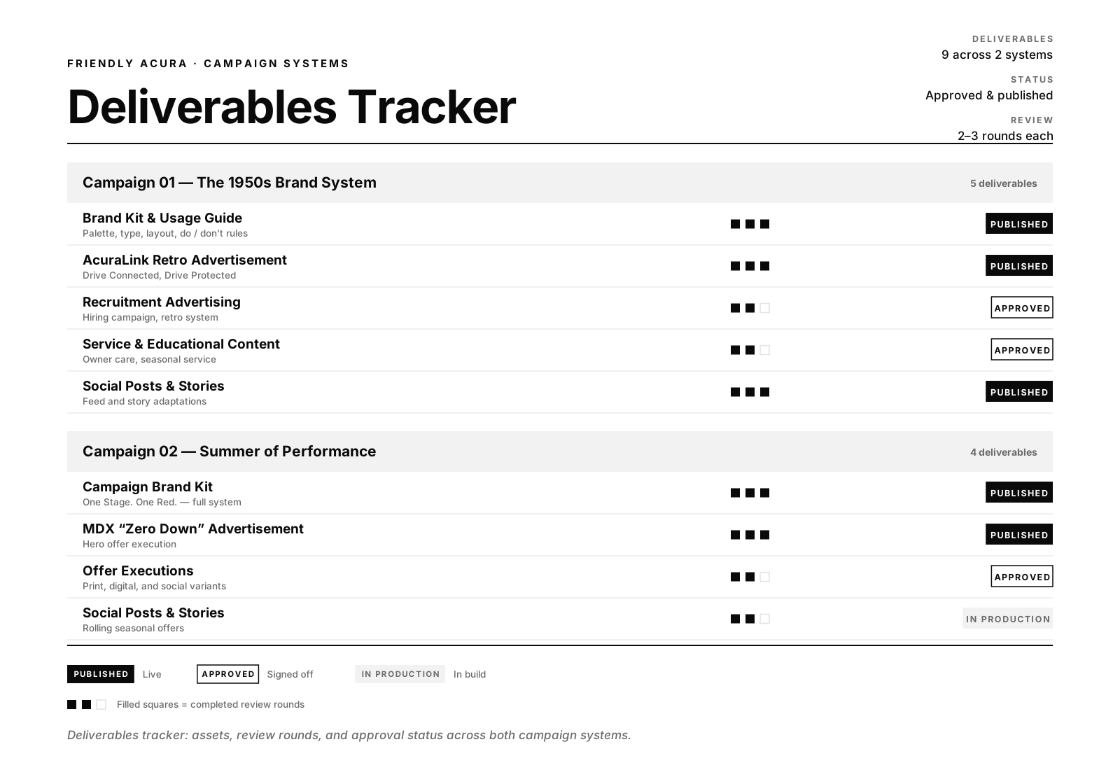
Dealership marketing and ownership; presented, reviewed, and revised through multiple rounds before publication.
Deliverables
Two campaign brand kits, customer and recruitment advertising, service and educational content, social posts and stories, event concept, floor plan, and 3D renders.
Status
Client work. Acura campaign systems approved and published. The Honda tent sale is scheduled for summer 2026; the plan and renders shown are planning visuals.
Part One

Friendly Acura

Integrated Brand & Campaign Development

Friendly Acura needed marketing that stood out in a crowded category without losing warmth, trust, or approachability. Two campaign systems were built to do different jobs: one carries the brand, the other sells the offer.

The brand system takes the word Friendly as its starting point and borrows the visual language of mid-century advertising — warmth, reliability, and service, made immediate and familiar. The promotional system does the opposite: stripped back, performance-led, built around the vehicle and a single number, with rules tight enough that any execution reads as one campaign.

Campaign 01

The 1950s Campaign

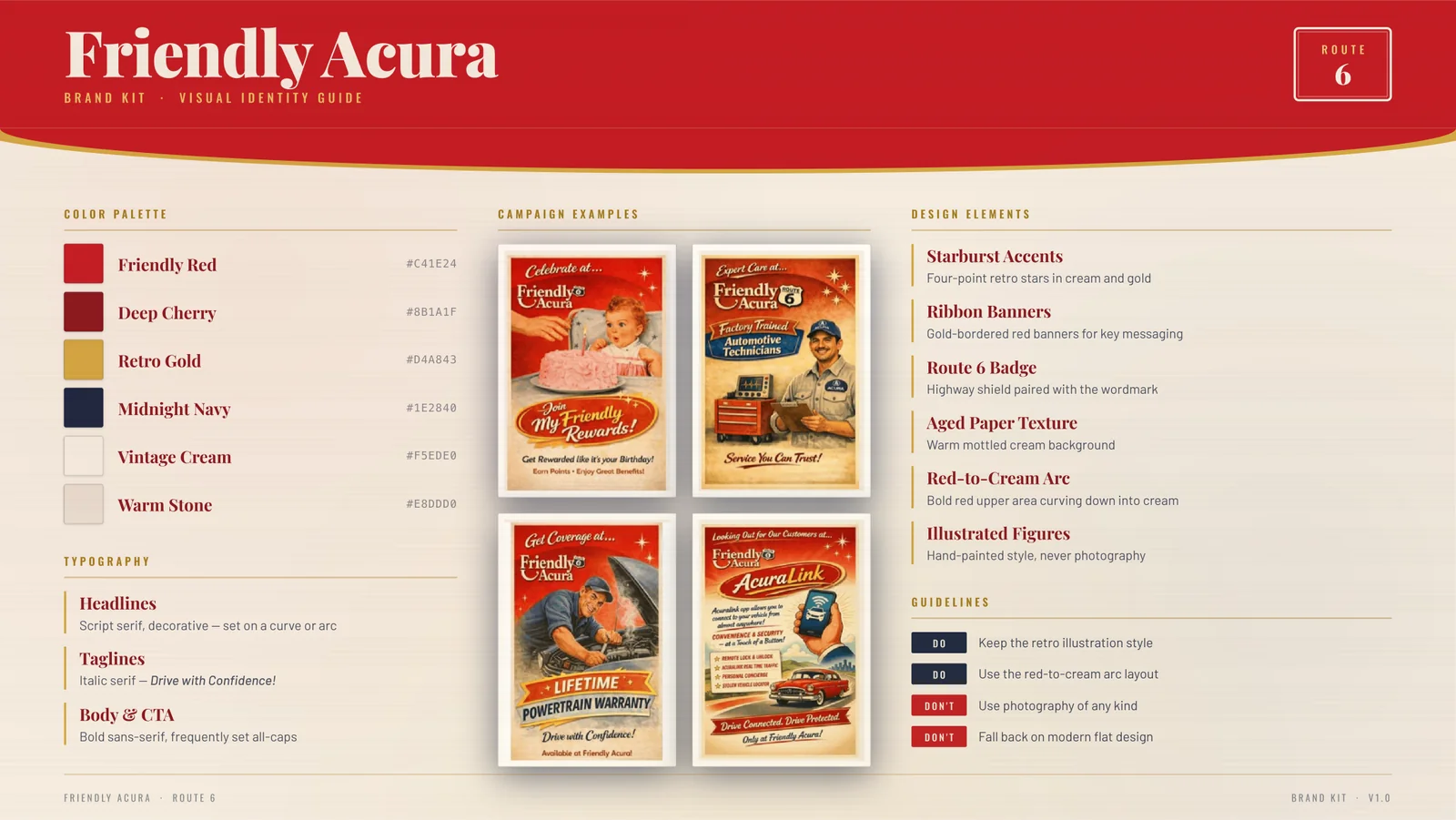
An intentional visual collage grew into a repeatable system: illustrated figures, decorative headlines, aged-paper texture, starbursts, ribbon banners, and a red-and-cream structural layout — documented as a brand kit so the dealership team can produce on-brand assets independently.

Retro Friendly Acura AcuraLink advertisement in the 1950s illustrated style: red-to-cream arc layout, Route 6 badge, ribbon banner reading Drive Connected, Drive Protected, and a hand-painted red sedan.
The retro system in application.
Updated Friendly Acura brand kit: red header with curved red-to-gold arc, color palette of Friendly Red, Deep Cherry, Retro Gold, Midnight Navy, Vintage Cream, and Warm Stone, typography rules for script-serif headlines and bold sans-serif calls to action, four framed campaign examples, and design elements with do and do-not guidelines.
Campaign guide establishing palette, typography, image treatment, and layout rules — written so the work can be produced without me.
Campaign 02

Summer of Performance

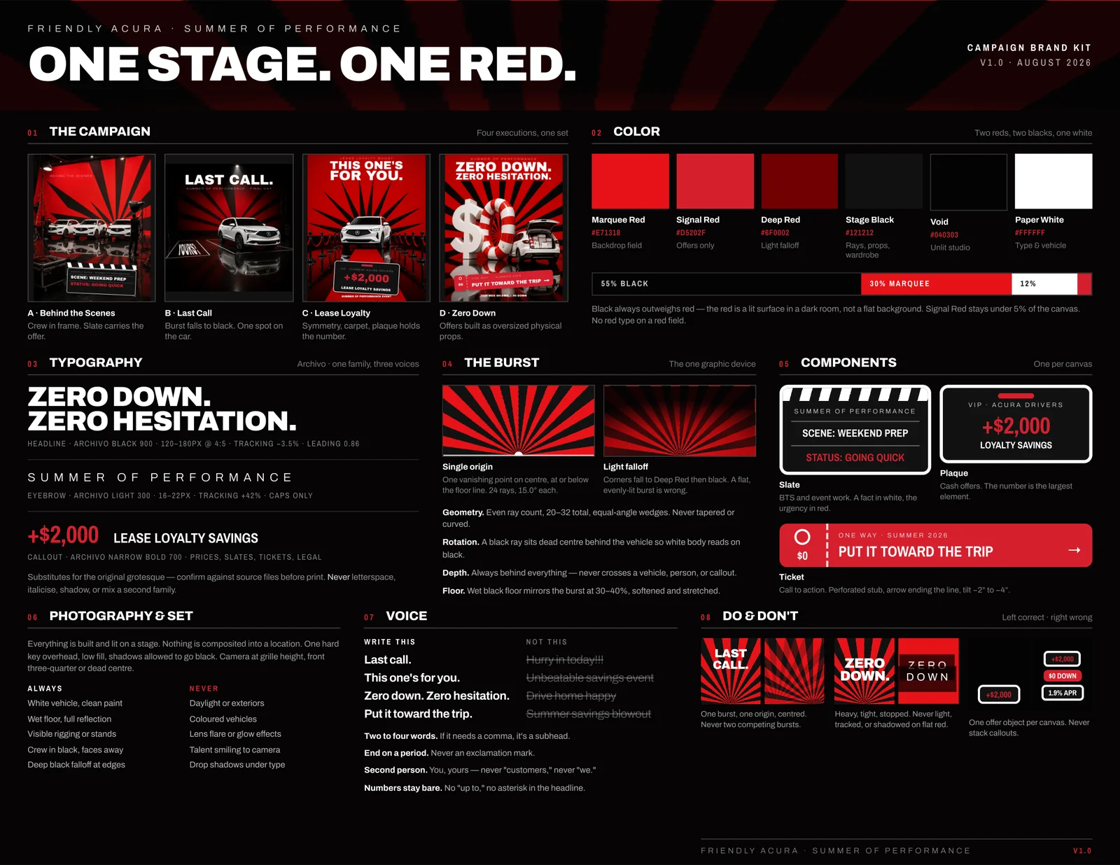
Summer of Performance is the offer-driven half of the account, and it runs on restraint. Everything is built and lit on a stage rather than composited into a location: one red radial burst, a white vehicle, a wet black floor, one physical offer object per canvas. Promotional language is held to four words or fewer and every price sits on a single component, so the number is always the loudest thing after the car.

The guide governs geometry as tightly as color — ray count, rotation, falloff, and floor reflection are all specified, which is what lets four different executions read as one campaign across print, digital, and social.

  • Two reds and two blacks
  • Black visually outweighs red
  • One radial burst per execution
  • One type family used in three voices
  • Headlines limited to four words or fewer
  • White vehicles remain the visual focus

Summer of Performance MDX advertisement: Zero Down, Zero Hesitation headline over a red-and-black sunburst, with a sculptural white dollar sign, striped pool float, and an MDX packed with luggage; a ticket graphic reads Put It Toward The Trip.
Zero Down. Zero Hesitation. — the system in execution.
Summer of Performance campaign brand kit titled One Stage One Red: marquee and signal reds on stage black, Archivo typography specimens, the radial burst graphic device, slate and plaque components, photography and set rules, and voice guidelines.
One Stage. One Red. — color specifications, type specimens, burst geometry, components, photography and set rules, voice guidelines, and do/don't.

How the Systems Adapt

Each campaign began with a defined objective, was presented to dealership stakeholders, revised, and prepared for publication. The two systems coexist without blurring: one client voice, two registers — brand and offer — each governed by its own written rules.

Part Two

Friendly Honda

Summer Tent Sale — Event Concept & Planning

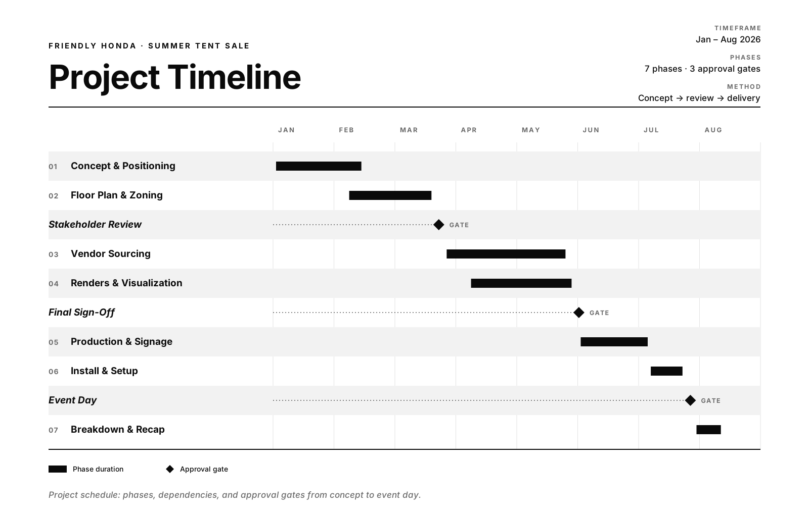
Scheduled for summer 2026. The plan and renders shown are planning visuals.

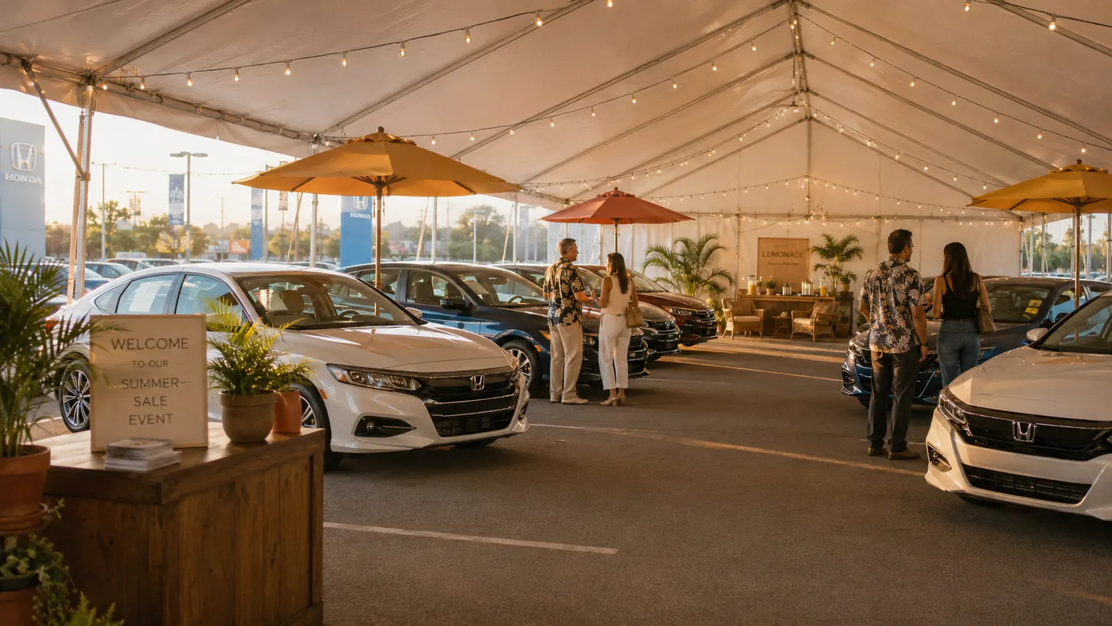
The previous tent sale felt closer to a children's party than an elevated dealership experience. The concept repositions it as a summer gathering — shade, seating, refreshment, and unhurried hospitality, with the vehicles part of the setting rather than the whole of it.

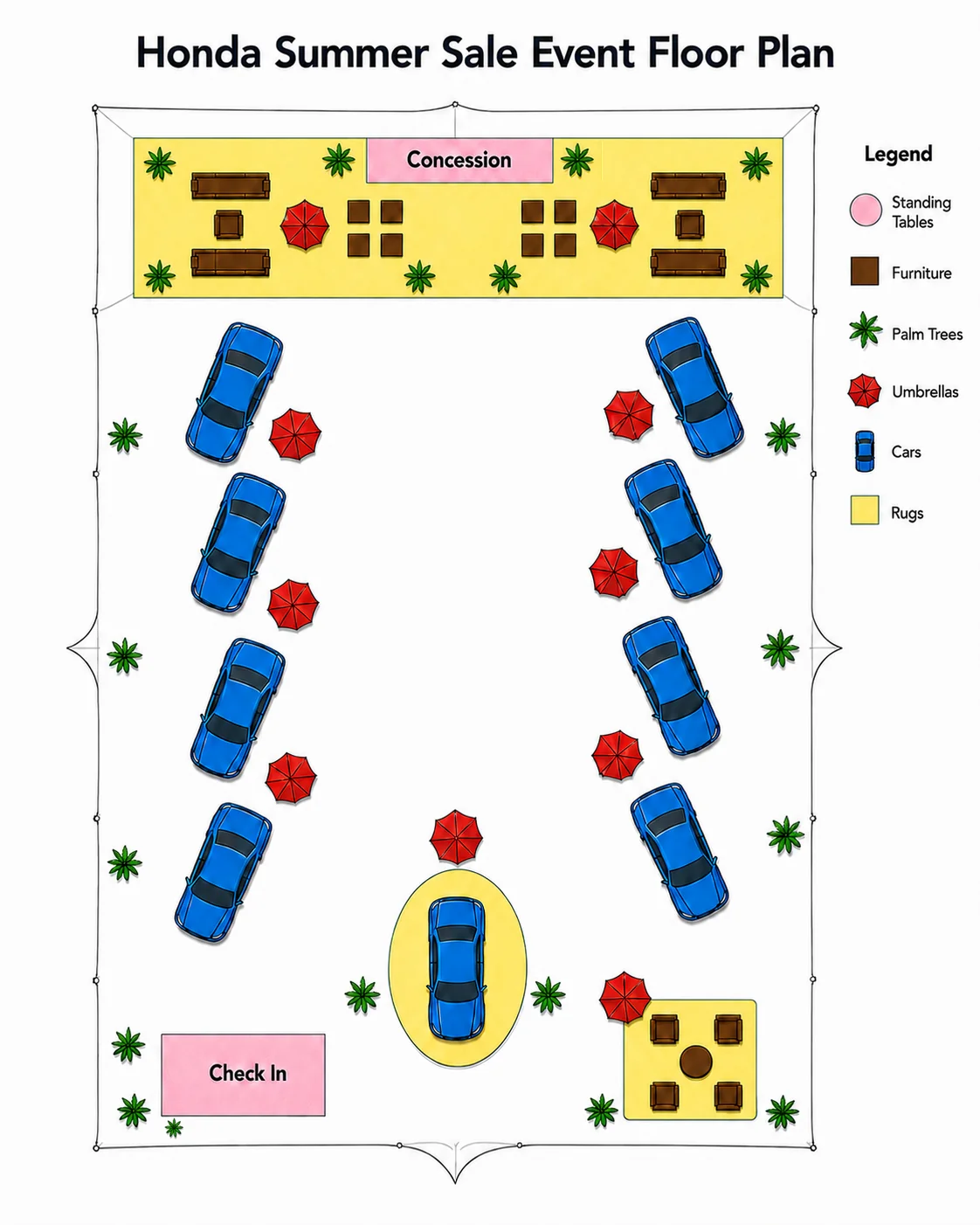
The event runs as a sequence of touchpoints: arrival and welcome, vehicle browsing, featured-vehicle moments, refreshments, games, seating, and hospitality. A floor plan and renders translate that into zones, circulation, and vehicle placement.

Main event render of the Friendly Honda summer tent sale: warm string lighting, market umbrellas, welcome table with signage, refreshment station, and vehicles arranged with clear walkways.
The tent sale as a summer gathering.
Honda summer sale event floor plan: check-in at the entry, a featured vehicle on a central rug, two angled rows of vehicles with umbrellas, palm trees, lounge furniture, standing tables, and a concession area along the back.
Floor plan: zones, circulation, and vehicle placement.

Outcome

One automotive group, supported across campaign development, brand systems, customer communication, and event planning. Two distinct campaign systems now serve different audiences while staying recognizably Friendly, and a routine sales event has a plan and renders that make the idea easy to communicate, approve, and repeat.
← All Work Case Study — 02 / 05
Spatial Design · Technical Documentation · Space Planning

Nature Versus Technology

Corporate Workplace — Programming, Space Planning & Technical Documentation

Does nature evolve from technology, or does technology emerge from nature? A corporate workplace built as the push and pull between the two — where they compete for the same space, each one thinning as the other thickens — documented end to end, from programming diagrams through floor plan, building section, and axonometric.

Project Snapshot

Objective
Design and document a functional corporate workplace built on the push and pull between natural growth and technological innovation — how each one produces and competes with the other.
Role
Full design, from programming through construction-level documentation.
Timeline
Full academic semester, developed through iterative critique.
Stakeholders
Faculty critique and formal review at concept, development, and final stages.
Deliverables
Adjacency, bubble, and sequential-experience diagrams; floor plan; building section; axonometric; material and planting strategy; renders.
Status
Academic. Workplace design and documentation set.

Concept

An office is where ideas are shared and innovative concepts are developed. Creation begins with a single idea, much like a seed — and everything we have originates from the earth. I examined the parallels between the creation of nature and the creation of technology, and asked whether nature evolves from technology, or technology emerges from nature.

The project's answer is that neither one comes first. They compete for the same space and they depend on each other to be there at all: the structure, power, and irrigation that make planting possible in a sealed building are technological, and the wood, daylight, and greenery that make that infrastructure bearable are natural. Take either away and the other stops working.

So nature here is not decoration applied to an office. It is one of two systems in constant negotiation, and the plan is built as the trade between them — where one thickens, the other thins. You are never standing in a natural space or a technological one. You are always in both, in a different ratio.

Ideation

The thought that opened it up was a small one: an entry-level employee and a CEO occupy the same space, and a corporate ladder is really just a climb. It felt serendipitous when it landed, and it pushed the project further than I had planned to take it.

Sketching the office as a landscape turned that into the organizing device. On a hike, the trees grow scarce as you rise — and here, density does the same work. The enclosed end sits low: dense planting, dark wood, close quarters. As the office opens out, the planting thins, the wood lightens, and the views lengthen, so how much nature surrounds you is what tells you where you are.

Walked the right way, the office is that ascent. You arrive at reception in the densest, most enclosed part of the plan and move outward, the trees thinning as you go, until you reach the open workstation floor and the lounge. It was essential that this live in the program rather than sit on top of it: the metaphor had to stay legible while still satisfying the constraints of a working office, and holding both at once is what keeps the push and pull between nature and technology running through the plan rather than decorating it.

Programming and Planning

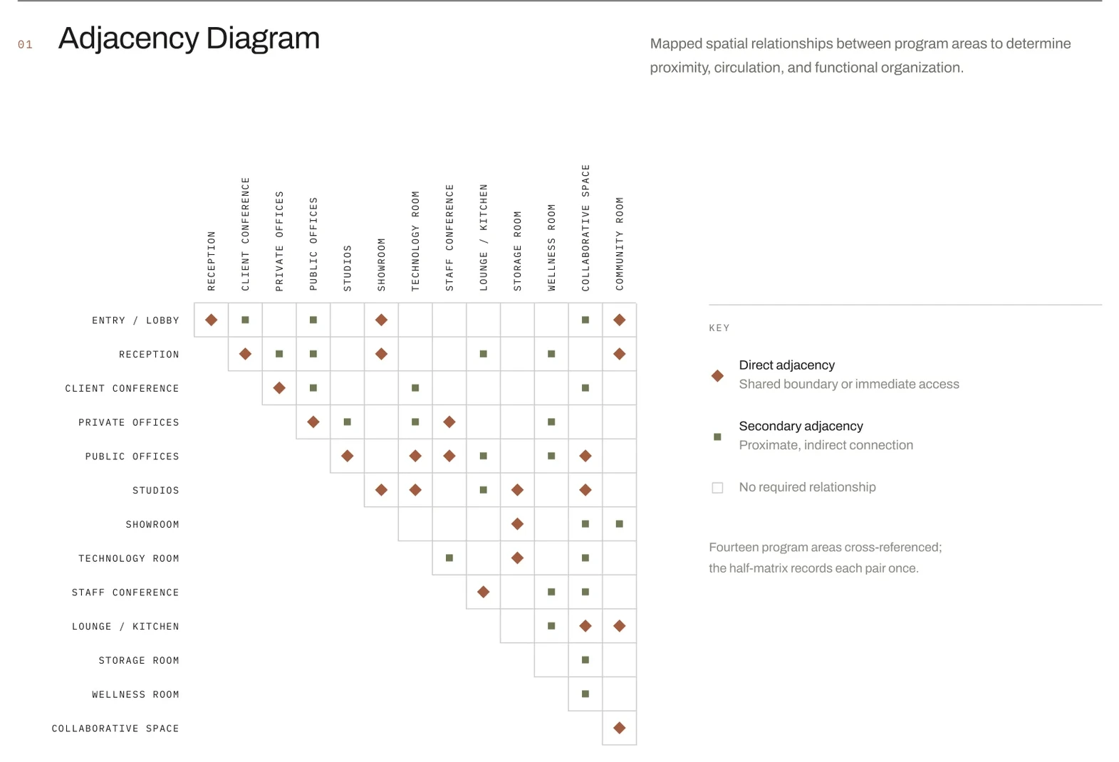
Program relationships, relative area, adjacency, and circulation were resolved before form: a progression from the enclosed arrival sequence outward to the open shared floor, following the route a visitor and an employee actually take through the building. The diagrams fix where the planting thins and where it thickens, so the density gradient is a planning rule the plan has to satisfy rather than a finish applied at the end.

Adjacency diagram mapping spatial relationships between program areas to determine proximity, circulation, and functional organization.
01 — Adjacency
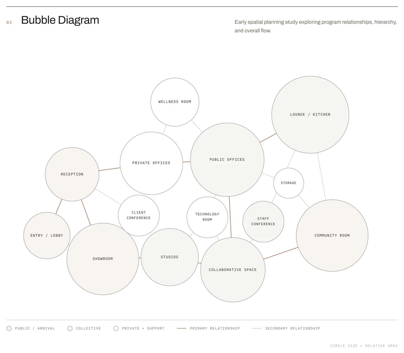
Bubble diagram exploring program relationships, hierarchy, and overall flow, with circle size indicating relative area.
02 — Bubble
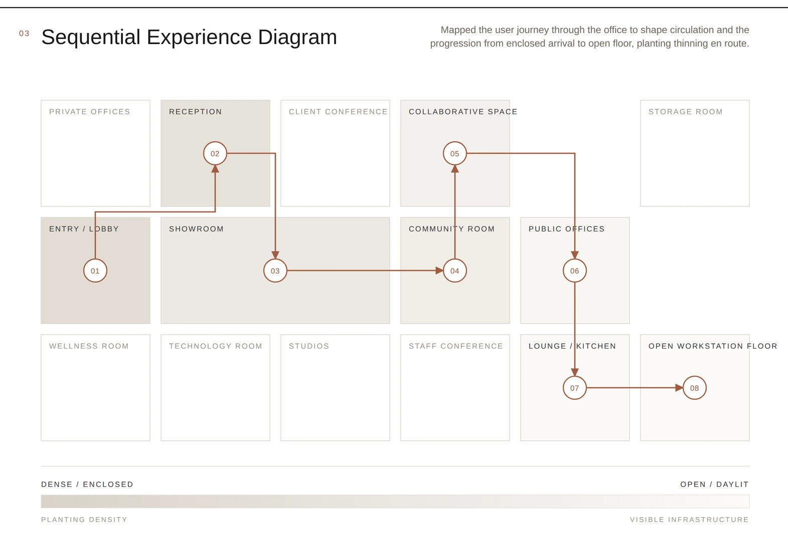
Sequential experience diagram mapping the eight-stop user journey through the office, from the enclosed entry and reception out to the open workstation floor. Rooms on the route step from dark to light along the way while off-route rooms stay unfilled, and a gradient bar below shows planting density trading against visible infrastructure.
03 — Sequential Experience

Process diagrams — programming and spatial analysis.

Technical Documentation

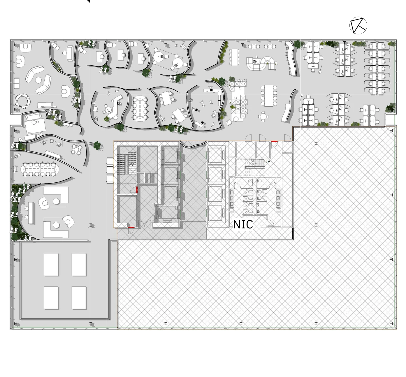
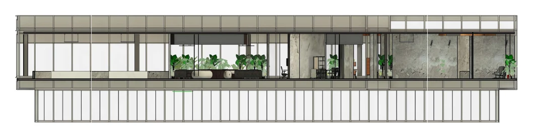
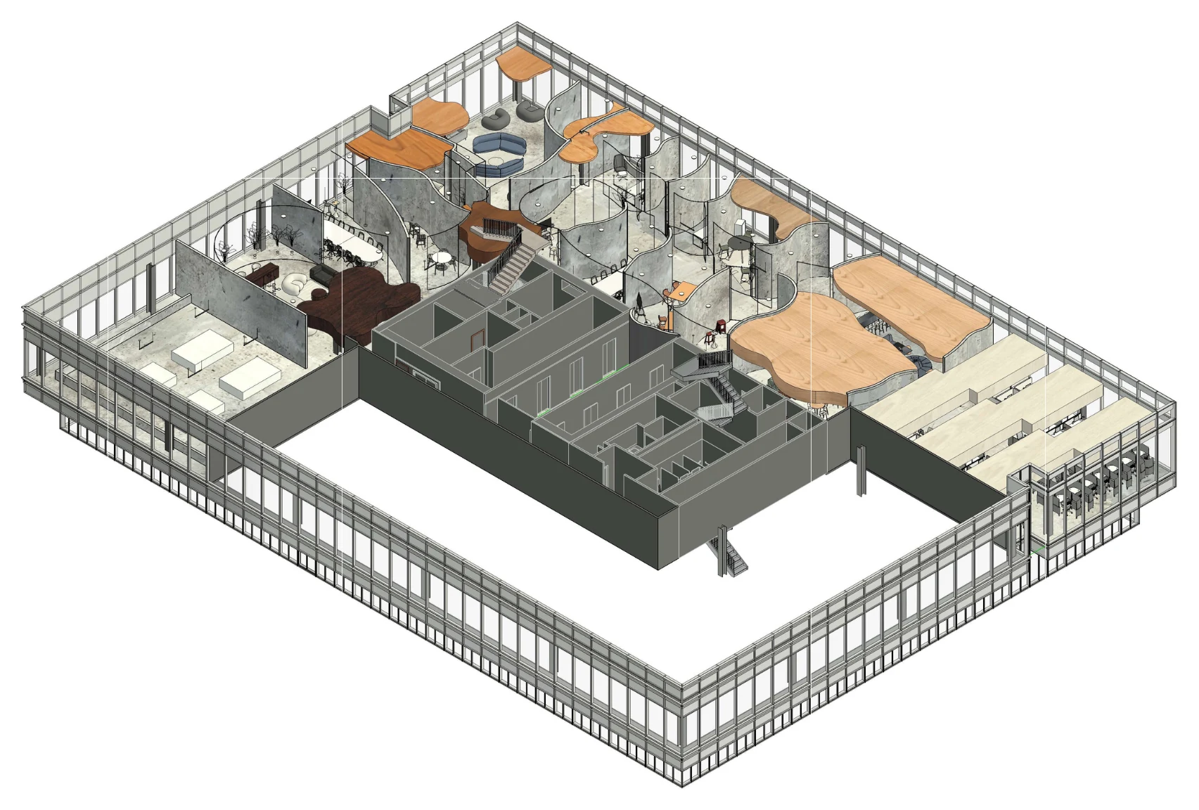
The floor plan, axonometric model, and building section carry the same trade: curved circulation, planted zones, material transitions, and the structural and mechanical systems that make the planting possible — the negotiation between the natural and the built, held at construction level. Drawn to be built from, not just looked at.

Developed workplace floor plan showing offices, studios, collaboration areas, workstations, circulation, planting, shared amenities, and public and private zones.
Developed floor plan.
Axonometric workplace overview showing curved partitions, private rooms, collaborative zones, open workstations, furniture, materials, and building structure.
Axonometric overview.
Long building section showing exterior glazing, planted areas, enclosed rooms, open workplace zones, material transitions, and daylight.
Building section.

Spatial System

Density, planting, materials, enclosure, and views all change together as users move through the office. Reception and the private rooms sit at the dense end: heavy overhead planting, dark wood, tight enclosure, views held close. Moving outward toward the open workstation floor and the lounge, the trees grow scarce — planting thins, wood lightens, ceilings lift, and daylight and long sightlines take over.

Because the gradient is consistent, it doubles as wayfinding. You can read how open or enclosed a space is from how much nature surrounds you, without a single sign. It is also where the trade becomes visible. In the dense zones the technology is still doing all the work — structure, irrigation, lighting, data — it is simply buried in planting. In the open zones the infrastructure is exposed and the greenery retreats to what daylight and long spans allow. Neither ever leaves; they only exchange which one you can see.

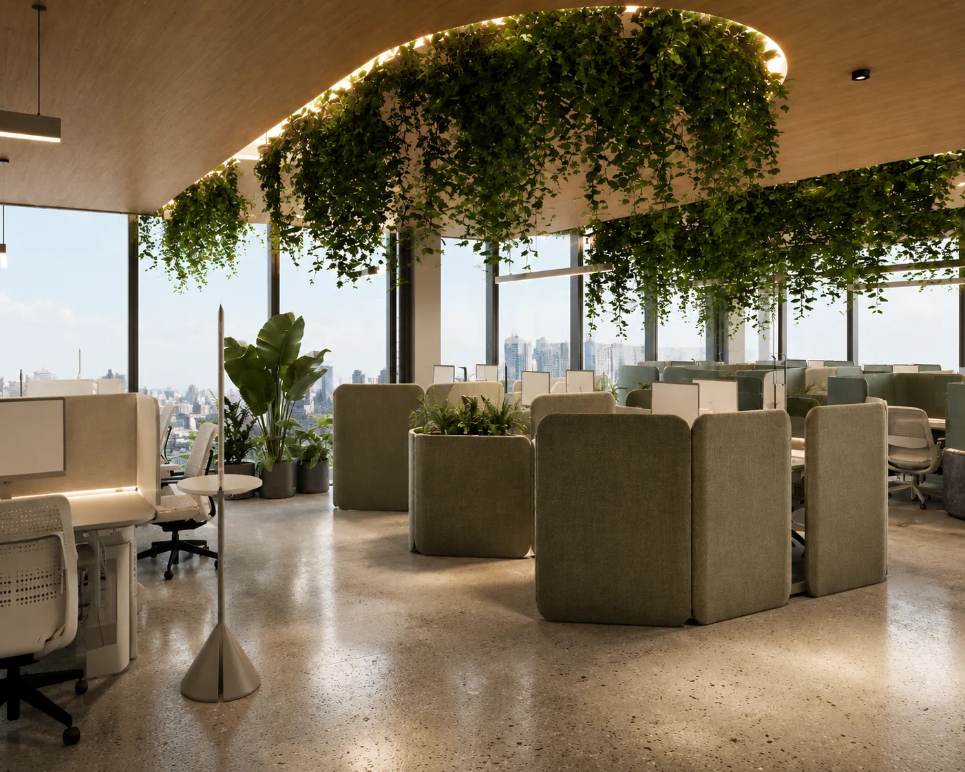
Corporate workplace with integrated ceiling planting, warm wood, daylight, collaborative workstations, privacy screens, and technological infrastructure.
Integrated planting, daylight, and privacy in the open workplace.

Where the Two Systems Meet

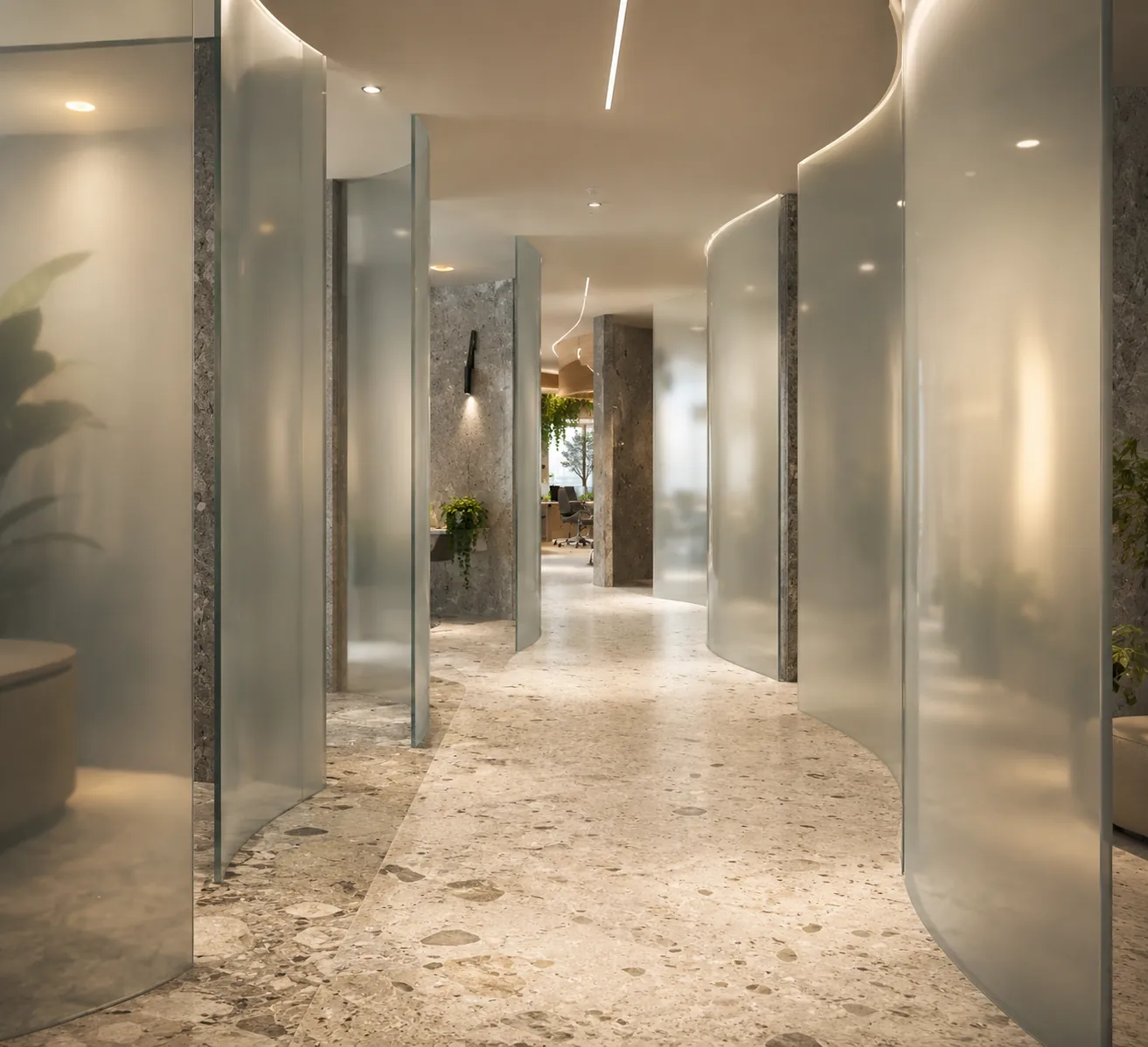
The partitions are where the negotiation is most literal. They are precisely engineered translucent panels — a technological product — cut into organic curves that follow planting rather than structure, so the boundary between zones is a gradient rather than a wall. Circulation becomes a gradual change in enclosure instead of a corridor with doors.

That is the argument at eye level: neither system wins the edge. The curve is natural, the panel is manufactured, and the space works because both are true at once.

Curved workplace corridor formed by translucent partitions, terrazzo flooring, stone surfaces, integrated lighting, and planted views.
Curved partitions shape movement between zones.

Outcome

The question the project started with does not resolve into an answer so much as a working arrangement: nature and technology grow out of one another, and an office can be built to hold both at the same time. Program, circulation, enclosure, planting, and documentation all follow the same gradient — dense where you arrive, scarce where the floor spreads out — and at every point along it the two systems are trading visibility rather than territory. The set is complete enough to hand to someone else and build from.

← All Work Case Study — 03 / 05
Brand Activation · Deliverable Development · Object and Spatial Design

The Source

Mugler Alien — Object, Environment & Refill Ritual

Don't stage the bottle — excavate it. The Source reframes Alien not as something from another world, but as a relic of our own history.

Project Snapshot

Objective
Create a luxurious, photographable activation grounded in Mugler's existing refill ritual.
Role
Strategy, object and spatial design, visualization, and presentation.
Timeline
Self-directed, developed across four concept iterations.
Stakeholders
Self-directed; developed as a presentation-ready proposal package.
Deliverables
Creative brief, limited-edition bottle concept, spatial experience, primary renders, overhead plan view, and presentation narrative.
Status
Speculative. Self-directed concept for Mugler Alien. Not commissioned or affiliated.

Brand Ritual

Mugler pioneered refillable fragrance and turned the refill into a ritual at its Fountain, also called the Source. The bottle is never discarded — only renewed. That existing ritual is the foundation.

Core Concept

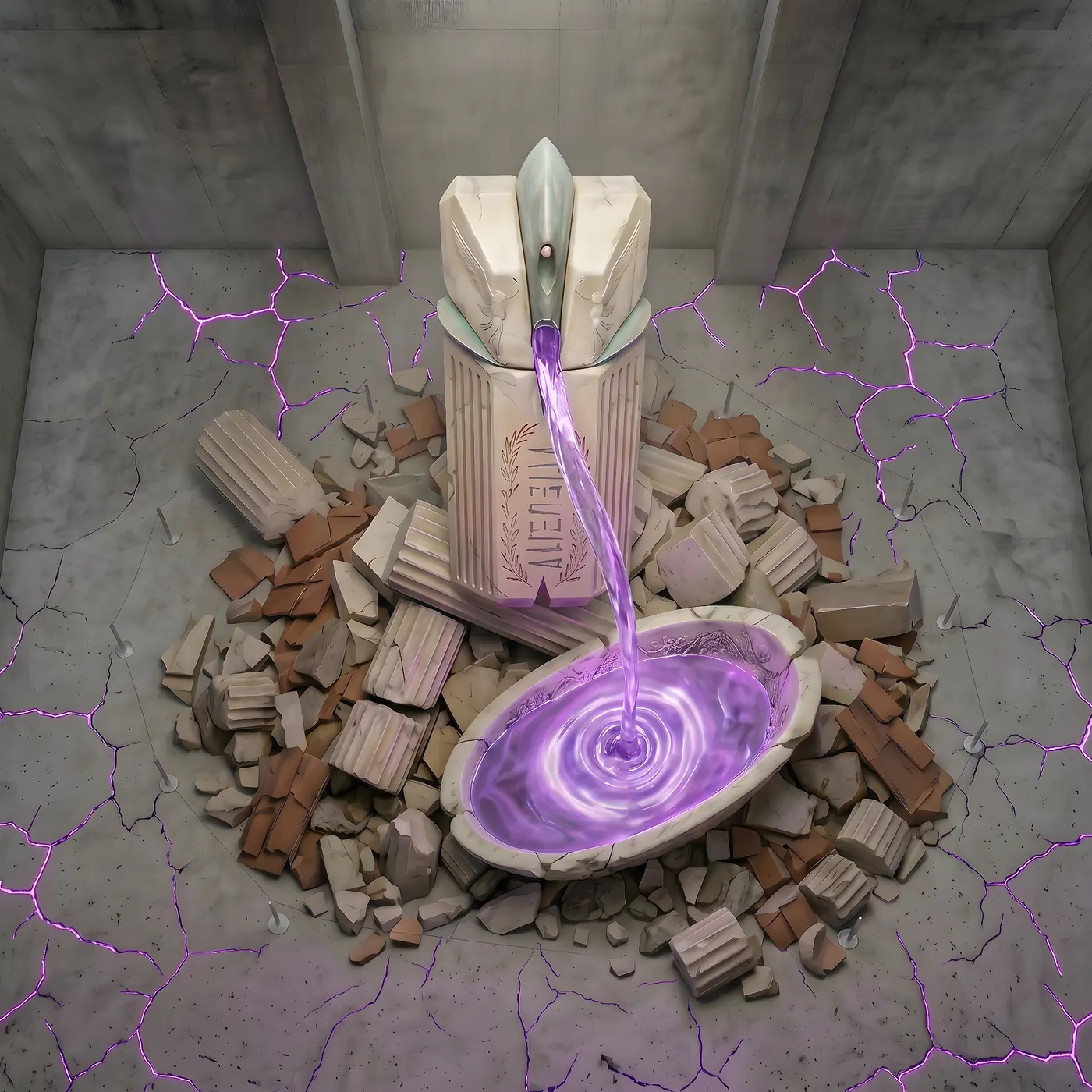
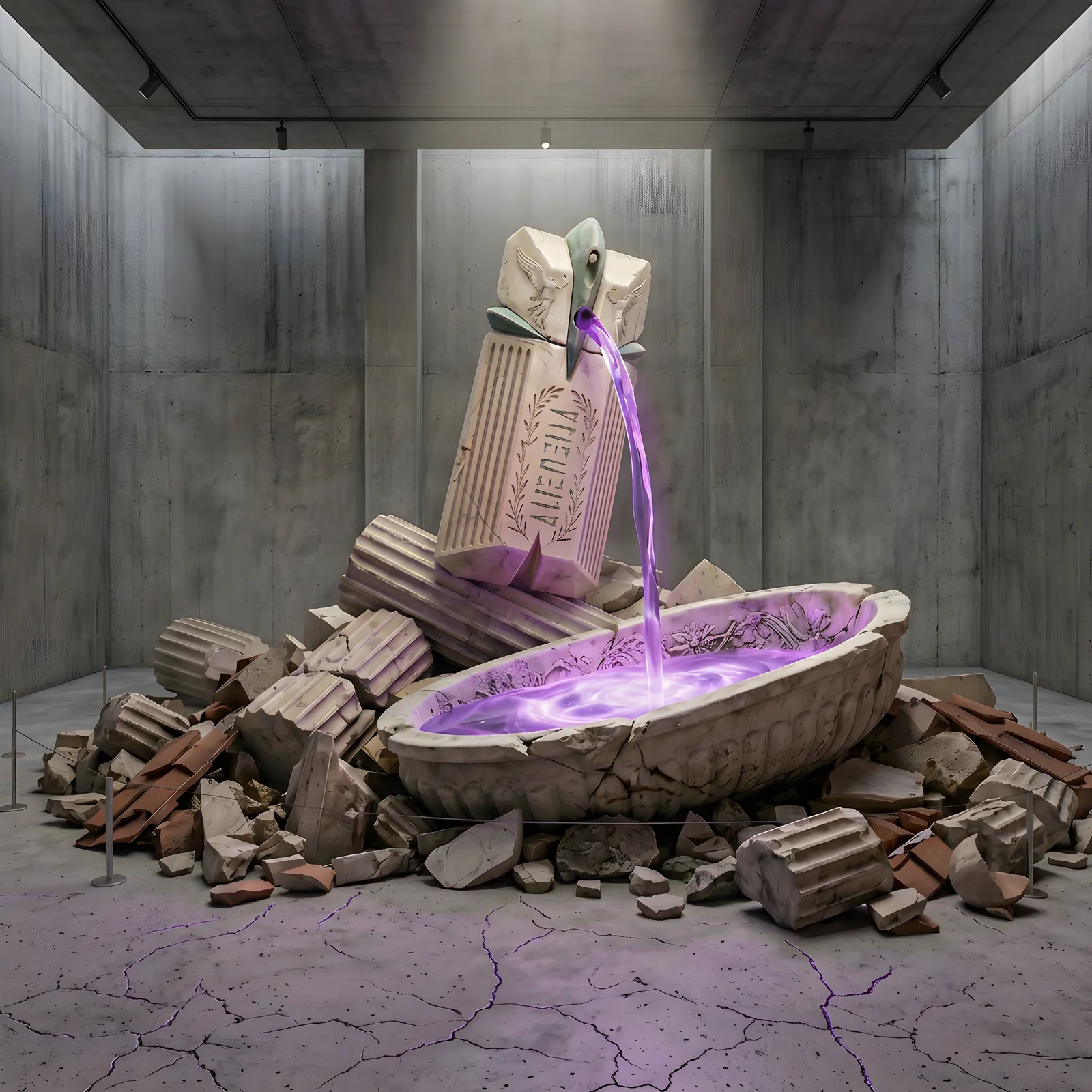
Alien is reframed as an object from human history rather than outer space — so refined, ancient, and unfamiliar that it seems impossible for a human hand to have made it. The relic is discovered among toppled columns beside a Source dry for centuries; as it is unearthed, fragrance returns to the basin. An excavation, not a crash.

The Source activation: the monumental relic bottle resting on toppled fluted columns, pouring a stream of violet parfum into a carved basin, surrounded by excavation rubble, stanchions, and cracked concrete veined with violet light.
The relic pours into the restored Source at the center of the excavation.

Object and Spatial Experience

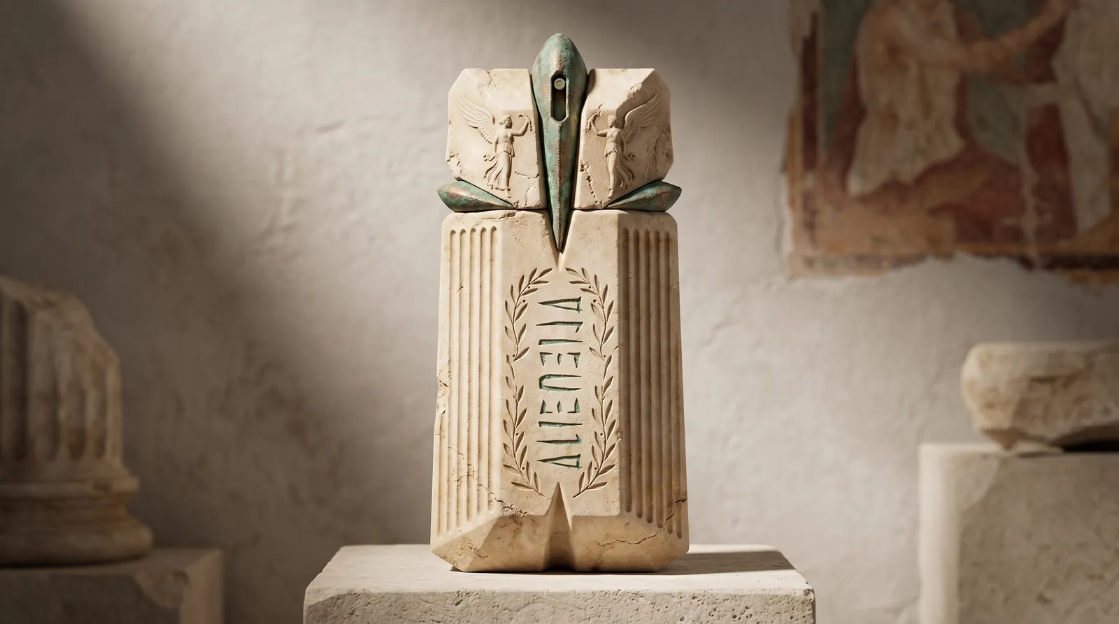
The bottle is recast in travertine and oxidized bronze — fluted like a column, winged Victories at its shoulders, its name held in a laurel wreath. The limited edition carries that name in reverse as an intaglio, readable only in the Fountain's reflection: the reason to return the bottle is embedded in the object itself.

Object study of the relic bottle: the Mugler Alien silhouette recast as carved travertine with winged figures in relief, fluted sides, an engraved name within a laurel wreath, and an oxidized bronze cap, photographed on a stone plinth against a fresco fragment.
The Alien bottle recast as a refillable artifact.

Around it, the excavation ring, rubble field, and viewing perimeter organize the visit as a discovery.

Overhead view of the activation: the relic bottle and basin at center, encircled by a rubble field of broken columns and terracotta fragments, perimeter pins, and violet-lit cracks radiating through the concrete floor.
Overhead view: excavation ring, basin, and circulation.

Development and Feasibility

  1. 01 — The Star Recognizable, but too generic at architectural scale.
  2. 02 — The Talisman Atmospheric, but read as a decorative prop.
  3. 03 — The Monument The bottle became the architecture.
  4. 04 — The Source The monument became an excavated relic tied to the refill ritual.

The centerpiece reads as stone but is built as CNC-milled cast composite with internal violet illumination, designed to break down, travel, and be rebuilt across locations. Engineering, pricing, and fabrication are the next phase.

Outcome

One ritual becomes one coherent world — object, environment, and narrative that travel together as a repeatable activation, packaged and documented well enough to present.

← All Work Case Study — 04 / 05
Exhibition Design · Visitor Journey · Spatial Narrative

Find the Gray Area

Immersive Fashion Exhibition — Six-Room Program

Find the Gray Area explores how people construct ideas of beauty and disgust. The double helix becomes both the conceptual and architectural framework, translating opposing DNA bases into a six-room visitor journey.

Project Snapshot

Objective
Create an immersive fashion exhibition that asks how ideas of beauty, disgust, identity, and judgment are constructed.
Role
Exhibition concept, architecture, programming, and visitor journey.
Timeline
Full academic semester, developed through iterative critique.
Stakeholders
Faculty critique and formal review at concept, development, and final stages.
Deliverables
Exhibition concept, visitor-journey diagram, six-room program, architectural sequence, and room renders.
Status
Academic. Exhibition design proposal.

Design Question

Not a survey of fashion history — an argument. How do people decide what is beautiful, what is disgusting, and how much of that judgment is inherited, learned, or internalized?

Concept and Visitor Journey

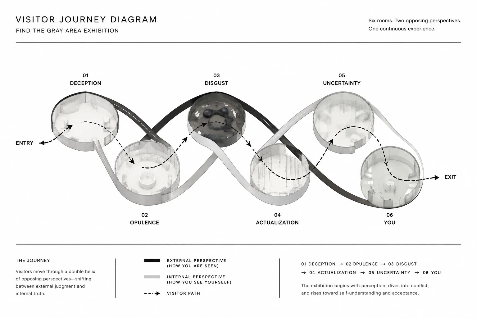
The double helix is both framework and architecture: three subjects split into six opposing rooms, moving visitors between external judgment and internal perception through circular rooms, controlled thresholds, and shifts in light and enclosure.

  1. 01 — Deception Beauty inherited rather than questioned.
  2. 02 — Opulence Beauty assumed through excess, status, and spectacle.
  3. 03 — Disgust Instinctive rejection and discomfort.
  4. 04 — Actualization Praise, judgment, and external perception.
  5. 05 — Uncertainty Reflection within the unresolved gray area.
  6. 06 — You Complexity, self-recognition, and acceptance.
Visitor-journey diagram showing six exhibition rooms arranged along a double helix from Deception and Opulence through Disgust, Actualization, Uncertainty, and You.
Six rooms on one continuous double-helix journey.

Room Sequence

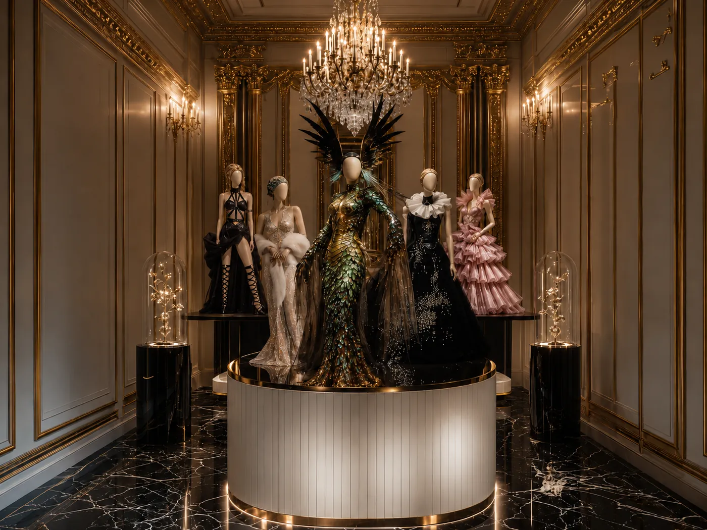
Opening exhibition room introducing inherited ideas of beauty through a controlled immersive fashion environment.
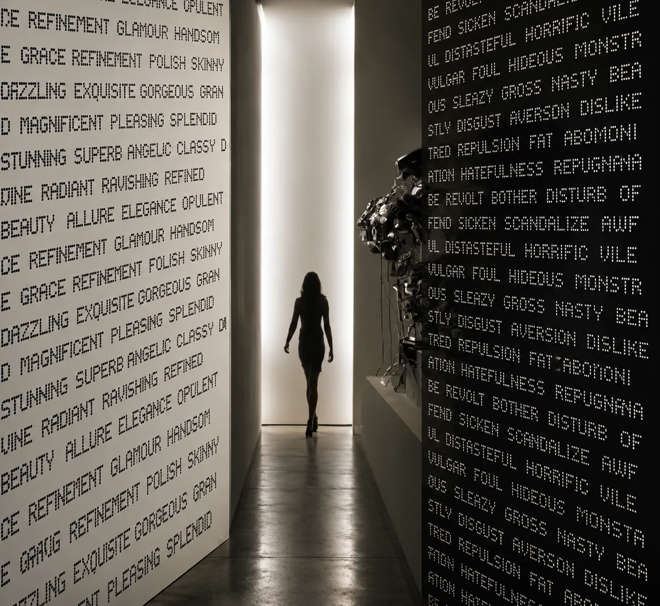
01 — Deception
Immersive circular fashion-exhibition room using reflective materials, controlled lighting, sculptural forms, and a central visitor experience.
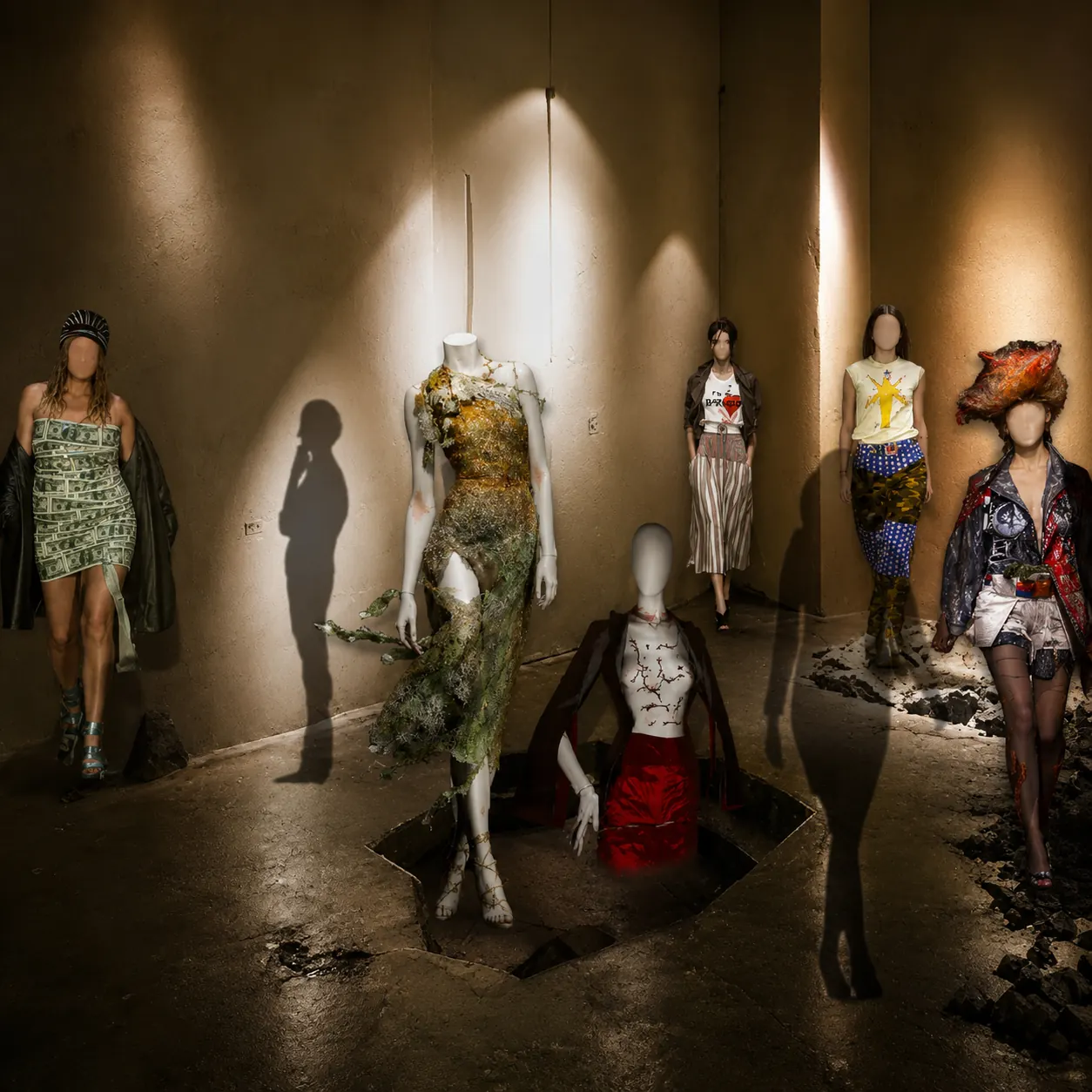
02 — Opulence
Exhibition room staging instinctive rejection: garments emerging from disturbed earth, raw clay walls, and unsettling fashion pieces under focused light.
03 — Disgust
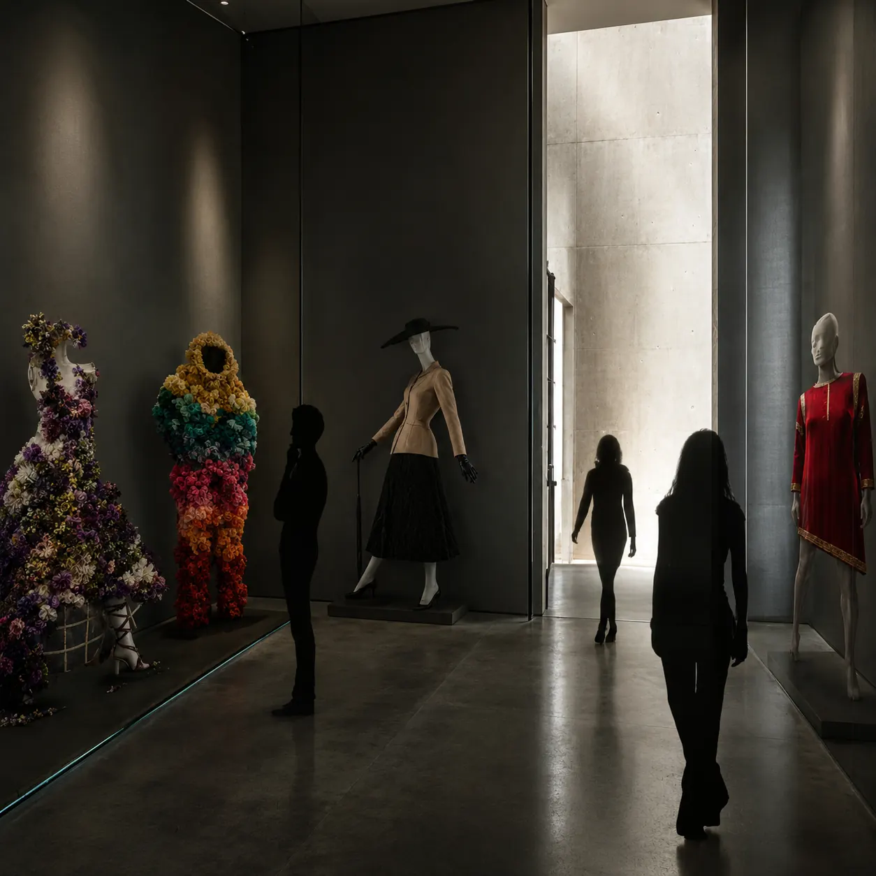
Middle exhibition room confronting visitors with discomfort, judgment, praise, rejection, and conflicting ideas of beauty.
04 — Actualization
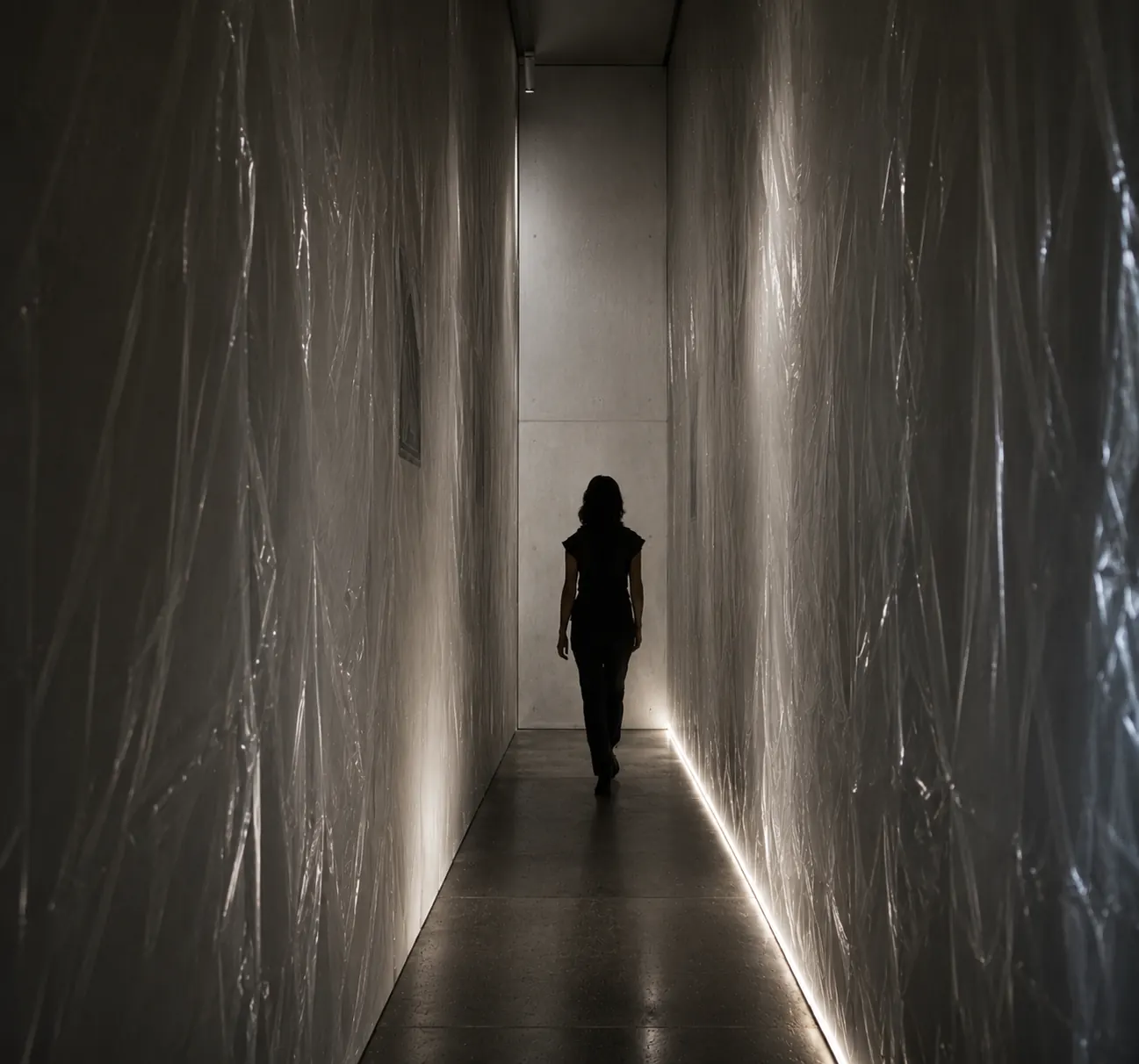
Narrow exhibition passage lined with translucent draped sheeting, lit at the floor, with a single visitor walking toward a concrete wall.
05 — Uncertainty
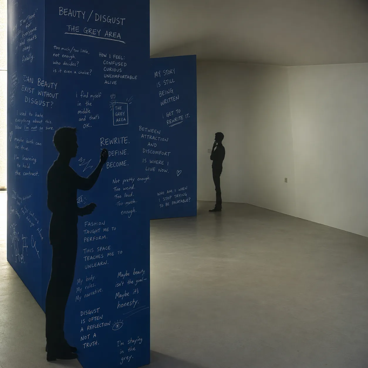
Final reflective exhibition room guiding visitors toward uncertainty, self-recognition, complexity, and acceptance.
06 — You

Outcome

A complex investigation becomes a legible six-room journey — architecture, interaction, and sequence carrying visitors from inherited judgment toward self-acceptance.

← All Work Case Study — 05 / 05
Campaign Strategy · Art Direction · Creative Development

The Chill Pill

Shark Handheld Fan — Concept & Six-Image Campaign System

The Chill Pill transforms Shark's handheld fan into a fictional wellness prescription, using humor, fashion, and cultural commentary to reclaim the stereotype of the chaotic woman who needs to "take a pill."

Project Snapshot

Objective
Turn Shark's handheld fan into the center of a memorable campaign with a cultural insight, visual world, and coordinated rollout.
Role
Strategy, art direction, image curation, and system development.
Timeline
Developed as an interview project.
Stakeholders
Presented as an interview submission.
Deliverables
Campaign concept, hero visual, product story, exploration collage, and six-image campaign system.
Status
Speculative interview project. Not commissioned or endorsed by Shark.

Campaign Idea

The proposed face of the campaign is an archetype rather than a person: the reality-television personality who is instantly recognizable and synonymous with owning it. The campaign reverses the trope of the supposedly hysterical woman who needs to "take a pill." Here she controls the narrative, and the prescription is deliberately absurd: a fan that simply cools her down.

Visual World

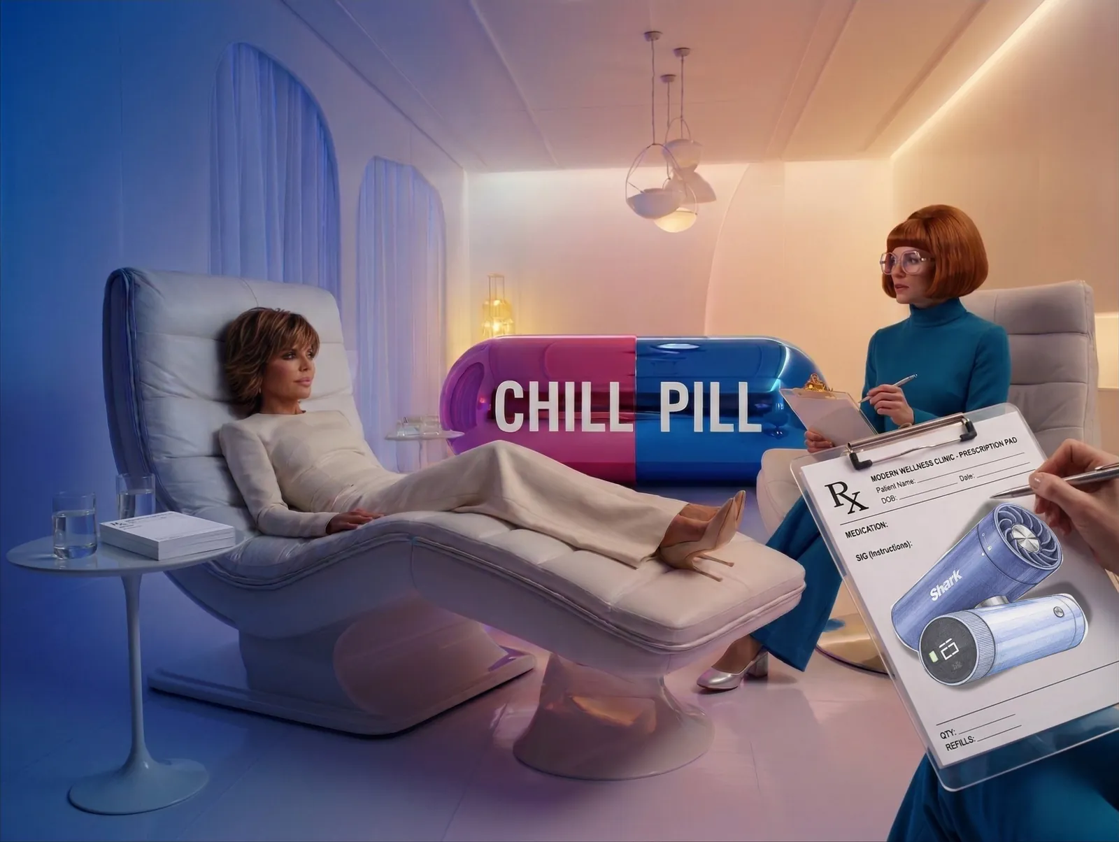
The campaign lives in a postmodern, mod-inspired wellness clinic: chrome, oversized capsules, prescription language, an all-female cast, and fashion-editorial posing. The real fan stays visible throughout, positioned as the prescription itself, so the joke supports the product instead of swallowing it.

Speculative campaign scene inside a mod-inspired wellness clinic, featuring a reclining proposed spokesperson, a counselor, an oversized Chill Pill capsule, and a prescription clipboard displaying the handheld fan.
The prescription is written: a Shark fan.
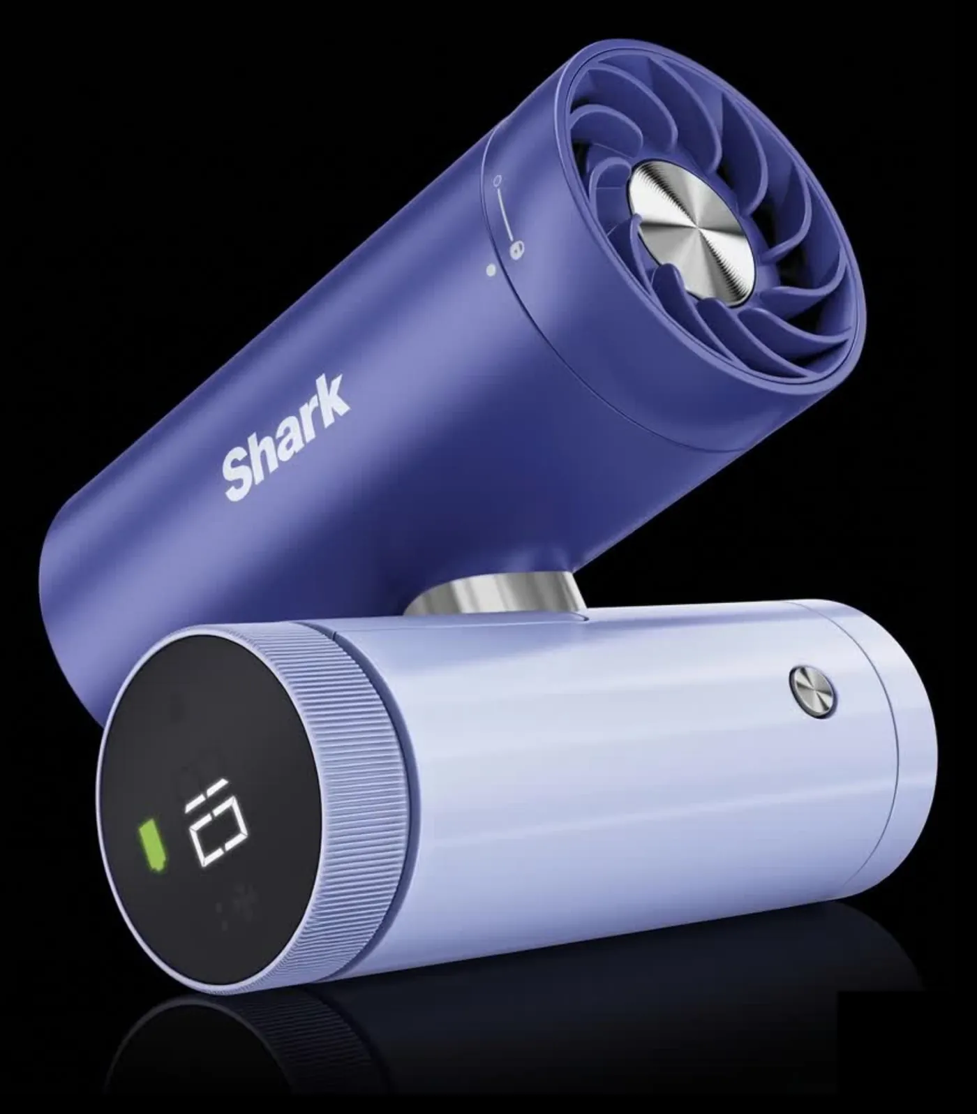
Blue and lavender Shark handheld fans arranged together against a dark background.
The product itself: both prescription and punchline.

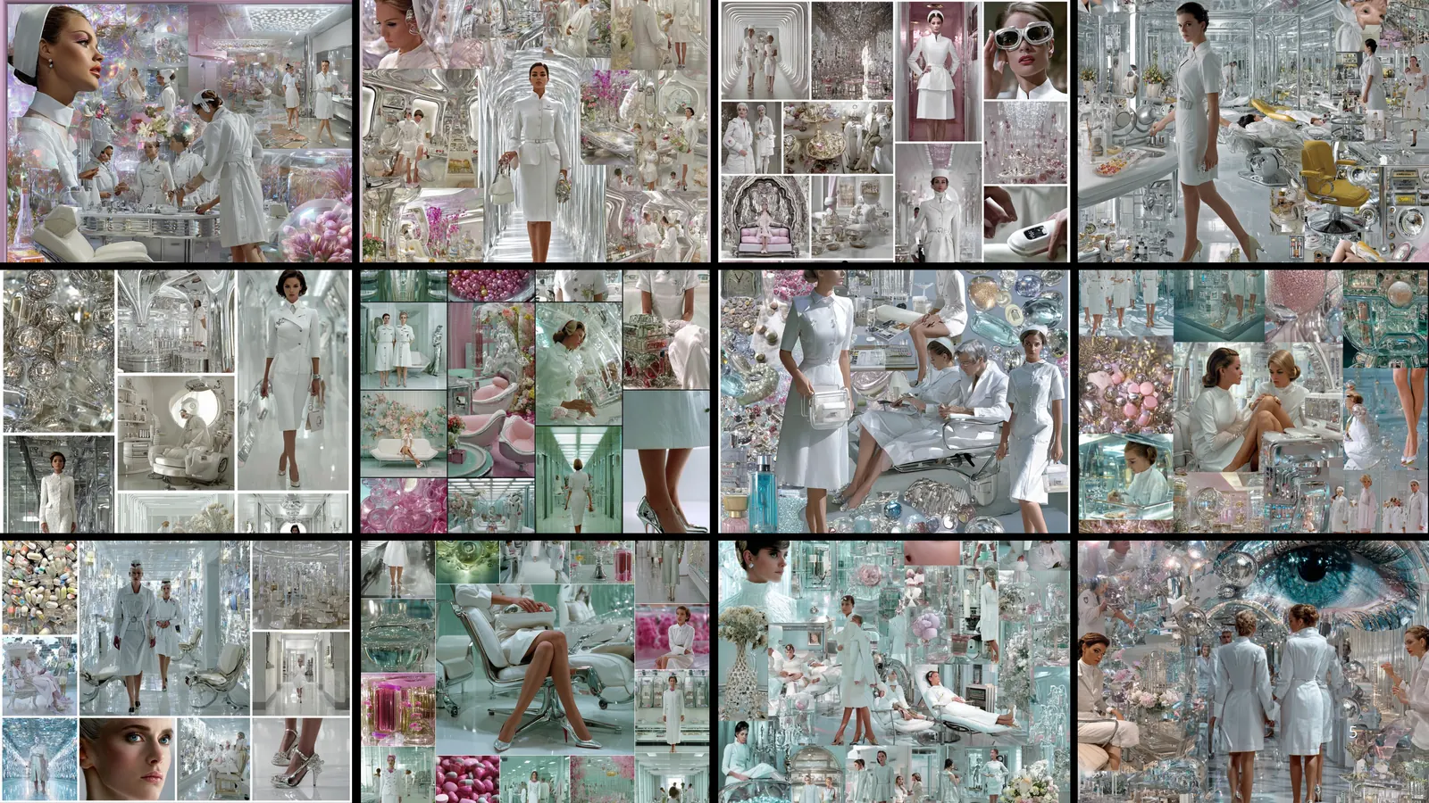
Exploration

AI-assisted generation and collage opened a wide field of environments, styling, and materials; my role was prompting, evaluation, curation, and final decision-making.

Curated visual-exploration collage combining chrome clinical interiors, mod fashion, white uniforms, capsules, beauty references, reflective materials, and experimental campaign environments.
The curated field that set the campaign's materials and language.

Campaign System

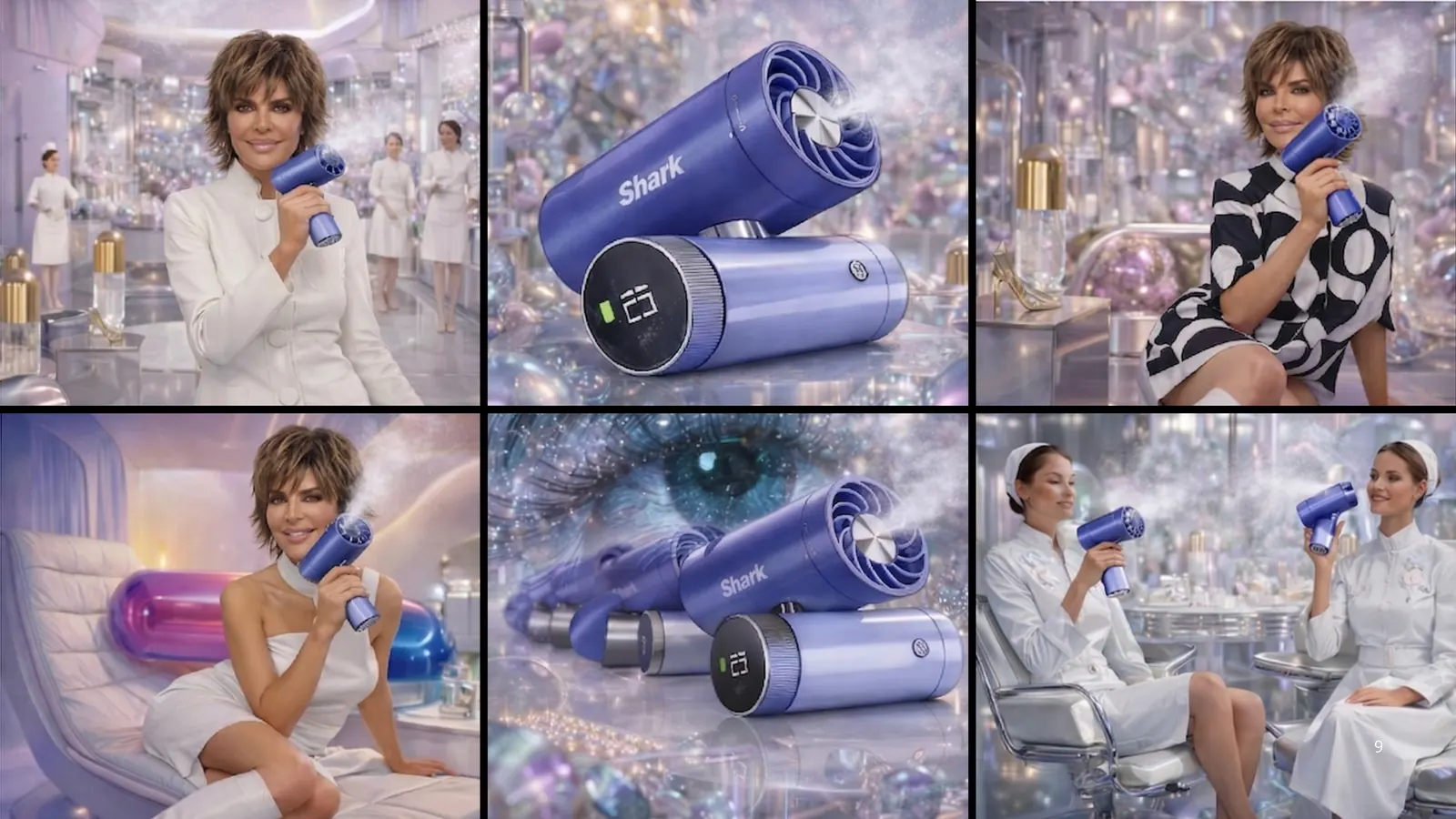
One concept extends across a coordinated family of images — spokesperson, product, supporting cast, and environment held together by styling and palette, consistent enough to brief a production team from.

Six-image speculative campaign grid combining the proposed spokesperson, Shark handheld fan, product imagery, supporting cast, and mod-inspired wellness-clinic environment.
The campaign as a system, not a single image.

Outcome

One product benefit carries an entire world — concept, joke, styling, and a six-image system that extends across a full rollout while staying product-first.